ShopDreamUp AI ArtDreamUp
Deviation Actions
It was through tistwas's project You Learn Something New Every Day that I first became interested in typography and text art. Ever since I've been astonished by the world of beauty this genre presents, a whole different universe of meanings and concepts, a whole different set of aesthetic rules. I've been enthralled at the way in which simple messages can gain the impact of a missile through the means of typography art. Sadly, I've also been surprised at how under-appreciated text art is in dA. Daily the text art gallery boasts only a few pages of new submissions, which compared to other digital media such as painting or photomanipulation is incredibly little. Still in life text plays a vital role in many areas of our lives. It is not only there to inform us - through graphic design we must learn to enjoy it for its aesthetic value. Allow me to share a quote on typography from an essay by Jan Tschichold:
Perfect typography depends on perfect harmony between all of its elements. We must learn, and teach, what this means. Harmony is determined by relationships or proportions. Proportions are hidden everywhere: in the capaciousness of the margins, in the reciprocal relationships to each other of all four margins on the page of a book, in the relationship between the leading of the type area and dimensions of the margins, in the placement of the page number relative to the type area, in the extent to which capital letters are spaced differently from the text, and not least, in the spacing of the words themselves. In short, affinities are hidden in any and all parts. Only through constant practice and strictest self-criticism may we develop a sense for a perfect piece of work.
Honestly I had thought creating text art wasn't so much of a challenge and indeed it takes a closer look at the medium to appreciate just how much effort, thought and creativity are involved in the process of creating an effective typography piece. This realisation made me curious to find out more about the subject and who else can give me a more in-depth insight into it than the very people who dedicate their creative juices to this very art form? So I conducted a survey asking talented typography artists what they think of today's text art and what is it in it that attracts them. The great number of responses I received just went to prove to me just how dedicated those people are and therefore what a fascinating art form text art is.
I hope the insights of the survey participants pique your interest and you enjoy the lovely works they are sharing with us.

I'm quite a beginner in type. I still don't know how to choose a font, maybe I'll know one day, it looks like a precise science! But I try to look further than "master-font" Helvetica. No doubt about its value, but I want to work on personal things, I guess Helvetica turned too common...
I like the way type art can value a message. People like skryingbreath can shape such powerful ideas with few elements.
Instead of him, I don't have many messages to tell, but I'm fond of music. All these artists who write songs, telling feelings and stories, sometimes stories they lived themselves... Lyrics that represent them better than any other portrait.
So one day, I tried to portrait Thom Yorke with his own lyrics (« how to disappear completely »). This song was perfect to illustrate the connection between the man, his lyrics, the meaning of the song and the final rendering of the picture. axlesax.deviantart.com/art/Tho…
I played behind lyrics in my last work about the Beatles : one of them, George Harrison, is missing physically, but the 3 others are represented with his lyrics. axlesax.deviantart.com/art/The…
As I said, that kind of work doesn't leave any written message, it tells behind the letters that lyrics are part of the person who wrote it. By the way, the whole collection brings a selection of good songs (at least for me), and I'm glad some friends discovered it by this way.
Type is the tool I needed to connect music with my work. I use it to work on a song I love, and I can give it new shapes.
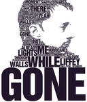


I first met with typography when I was on interview with university professor, before entrance exam to graphic design. I use typography to express my ideas, opinions. Nowadays typography is very extended, I think almost every designer uses typography, but only few are good.
And this is a problem of last years. In the present flooded typography scene it is very difficult to find good typography works.
:thumb150613527::thumb148665014::thumb148597737::thumb147880809::thumb146969665:

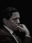
Digital typography, like anything powerful, is dangerous. It's incredibly easy to create, and I've seen a lot of stellar art made with it (in the past few years especially). On the flip side, it's also incredibly easy (and even more so common) for kerning, tracking, leading to become oversights. Back when type was manually set, I think there was a much stronger appreciation for getting every single character right. Now that's there's a whole lot more processing power, bigger displays, and more advanced application interfaces, the possibilities are virtually endless, as well as the errors. With power comes responsibility – typesetting digitally is no exception.
 :thumb113970529:

Digital text (Typography).. It's just amazing how much you can do with letters. I got interested in it because I started thinking how awkward it is how much we use letters; Magazines, advertisements, books, comics, posters, shoes, bags, computers. It's very amusing to me how you can create faces, logos and beautiful works of art even just with letters. It's kinda surreal how much we use them.
:thumb163485469::thumb164102063::thumb165012500:

I feel that typography today is consistently breaking boundaries. The way type has been utilized in the past few years is just jaw-dropping. I see so many different ways to use type that it kind of comes second nature. It's like learning how to walk, you observe and practice until you get it then its smooth sailing. The precision needed and charisma created are the two main reasons I'm attracted to working with type.


To me Text art and Typography is like the furniture of thoughts... It's where the ideas sets and get noticed, it is what I do to express ideas effectively.
I always look for the message inside the work, because the concept in there what does make sense of the piece. it's good to show off new techniques and experiment with new tools, but to me in the end concept is what really matters.


I think Typography is one of the most important elements in design and I also think that many people underestimate the importance and the power of a good typographical design. I see typography in many different uses every day and not many of them stick in my mind. But if a certain piece catches my eye I look closely at it and try to figure out what about this piece was so special. Is it the font? The colour? Or is it the letter spacing or the font size? There are so many important factors that define an awesome typo work. And I think the never-ending amount of possibilities that you have to make a good piece of Text art is the certain thing that fascinates me about Typography. You're only really limited by your imagination.


When we talk about digital typography we're not just talking about conventional text art (i.e., text as a part of images) but increasingly web typography as well (text on webpages). I think it's always heartening to see people paying more attention to something that interests you, because typography has not always been part of the consciousness of graphic or web designers - including the casual ones - that did not go out of the way to think about how they use and treat type. Even if it's people hopping on the "I Love Helvetica" bandwagon without really knowing why Arial is "ugly" or why Helvetica is "beautiful", it shows that people think typography is something that is significant and worth their opinion. And that is fantastic. More and more, design websites are regularly posting typography features and I think that's really excellent in increasing the awareness and appreciation of typography. (Just taking an opportunity to drop a bit of self promotion here, do check out the Massive Feature of Typographic Goodness)
I've never been formally educated in design, but typography fascinates me: I've always had this huge collection of fonts on my computer, even from a young age when I was just dabbling in design work here and there. I'd like to think that I've come a bit since, reading and researching a whole lot. It's very easy to put down type-geeks (in the making) like me when we make little or no sense raving about generous counters, beautiful beak terminals, adnate and abrupt serifs and other bullshit like that, but I'm sure every one of us can appreciate a well put-together set of characters. I love how a character can be crafted in so many different ways (just look at the ampersand) and how we can employ different typefaces to serve different functions in a design. I'm not sure McLuhan had typography in mind when he said the message is the medium, but typography is one medium that I think we shouldn't overlook when trying to show or tell something through your work.
I guess it is apt, if a little presumptuous, for me to provide some advice to budding digital text artists. Take time to find your groove--the style that works for you. I experimented with type for a long time before I settled on my current style. On hindsight, my earlier works were awful, but how was I to learn otherwise?


Typography seems so basic and artless - doesn't it? It's just words on a page, designed every which way.
No - typography is the art of arranging words for stylistic effect. Typography makes words float off the design - they can sizzle, they can pop, and they can crackle - it's up to the artist.


---
Due to the overwhelming amount of responses received I decided to split the results of the survey into several news articles. For more interesting opinions and even more astounding typography pieces, stay updated. There will be more soon! (Wink)")
Don't forget to check our Love Letter Contest

Perfect typography depends on perfect harmony between all of its elements. We must learn, and teach, what this means. Harmony is determined by relationships or proportions. Proportions are hidden everywhere: in the capaciousness of the margins, in the reciprocal relationships to each other of all four margins on the page of a book, in the relationship between the leading of the type area and dimensions of the margins, in the placement of the page number relative to the type area, in the extent to which capital letters are spaced differently from the text, and not least, in the spacing of the words themselves. In short, affinities are hidden in any and all parts. Only through constant practice and strictest self-criticism may we develop a sense for a perfect piece of work.
Honestly I had thought creating text art wasn't so much of a challenge and indeed it takes a closer look at the medium to appreciate just how much effort, thought and creativity are involved in the process of creating an effective typography piece. This realisation made me curious to find out more about the subject and who else can give me a more in-depth insight into it than the very people who dedicate their creative juices to this very art form? So I conducted a survey asking talented typography artists what they think of today's text art and what is it in it that attracts them. The great number of responses I received just went to prove to me just how dedicated those people are and therefore what a fascinating art form text art is.
I hope the insights of the survey participants pique your interest and you enjoy the lovely works they are sharing with us.
I'm quite a beginner in type. I still don't know how to choose a font, maybe I'll know one day, it looks like a precise science! But I try to look further than "master-font" Helvetica. No doubt about its value, but I want to work on personal things, I guess Helvetica turned too common...
I like the way type art can value a message. People like skryingbreath can shape such powerful ideas with few elements.
Instead of him, I don't have many messages to tell, but I'm fond of music. All these artists who write songs, telling feelings and stories, sometimes stories they lived themselves... Lyrics that represent them better than any other portrait.
So one day, I tried to portrait Thom Yorke with his own lyrics (« how to disappear completely »). This song was perfect to illustrate the connection between the man, his lyrics, the meaning of the song and the final rendering of the picture. axlesax.deviantart.com/art/Tho…
I played behind lyrics in my last work about the Beatles : one of them, George Harrison, is missing physically, but the 3 others are represented with his lyrics. axlesax.deviantart.com/art/The…
As I said, that kind of work doesn't leave any written message, it tells behind the letters that lyrics are part of the person who wrote it. By the way, the whole collection brings a selection of good songs (at least for me), and I'm glad some friends discovered it by this way.
Type is the tool I needed to connect music with my work. I use it to work on a song I love, and I can give it new shapes.
I first met with typography when I was on interview with university professor, before entrance exam to graphic design. I use typography to express my ideas, opinions. Nowadays typography is very extended, I think almost every designer uses typography, but only few are good.
And this is a problem of last years. In the present flooded typography scene it is very difficult to find good typography works.
:thumb150613527::thumb148665014::thumb148597737::thumb147880809::thumb146969665:
Digital typography, like anything powerful, is dangerous. It's incredibly easy to create, and I've seen a lot of stellar art made with it (in the past few years especially). On the flip side, it's also incredibly easy (and even more so common) for kerning, tracking, leading to become oversights. Back when type was manually set, I think there was a much stronger appreciation for getting every single character right. Now that's there's a whole lot more processing power, bigger displays, and more advanced application interfaces, the possibilities are virtually endless, as well as the errors. With power comes responsibility – typesetting digitally is no exception.
:thumb113970529:Digital text (Typography).. It's just amazing how much you can do with letters. I got interested in it because I started thinking how awkward it is how much we use letters; Magazines, advertisements, books, comics, posters, shoes, bags, computers. It's very amusing to me how you can create faces, logos and beautiful works of art even just with letters. It's kinda surreal how much we use them.
:thumb163485469::thumb164102063::thumb165012500:
I feel that typography today is consistently breaking boundaries. The way type has been utilized in the past few years is just jaw-dropping. I see so many different ways to use type that it kind of comes second nature. It's like learning how to walk, you observe and practice until you get it then its smooth sailing. The precision needed and charisma created are the two main reasons I'm attracted to working with type.
To me Text art and Typography is like the furniture of thoughts... It's where the ideas sets and get noticed, it is what I do to express ideas effectively.
I always look for the message inside the work, because the concept in there what does make sense of the piece. it's good to show off new techniques and experiment with new tools, but to me in the end concept is what really matters.
I think Typography is one of the most important elements in design and I also think that many people underestimate the importance and the power of a good typographical design. I see typography in many different uses every day and not many of them stick in my mind. But if a certain piece catches my eye I look closely at it and try to figure out what about this piece was so special. Is it the font? The colour? Or is it the letter spacing or the font size? There are so many important factors that define an awesome typo work. And I think the never-ending amount of possibilities that you have to make a good piece of Text art is the certain thing that fascinates me about Typography. You're only really limited by your imagination.
When we talk about digital typography we're not just talking about conventional text art (i.e., text as a part of images) but increasingly web typography as well (text on webpages). I think it's always heartening to see people paying more attention to something that interests you, because typography has not always been part of the consciousness of graphic or web designers - including the casual ones - that did not go out of the way to think about how they use and treat type. Even if it's people hopping on the "I Love Helvetica" bandwagon without really knowing why Arial is "ugly" or why Helvetica is "beautiful", it shows that people think typography is something that is significant and worth their opinion. And that is fantastic. More and more, design websites are regularly posting typography features and I think that's really excellent in increasing the awareness and appreciation of typography. (Just taking an opportunity to drop a bit of self promotion here, do check out the Massive Feature of Typographic Goodness)
I've never been formally educated in design, but typography fascinates me: I've always had this huge collection of fonts on my computer, even from a young age when I was just dabbling in design work here and there. I'd like to think that I've come a bit since, reading and researching a whole lot. It's very easy to put down type-geeks (in the making) like me when we make little or no sense raving about generous counters, beautiful beak terminals, adnate and abrupt serifs and other bullshit like that, but I'm sure every one of us can appreciate a well put-together set of characters. I love how a character can be crafted in so many different ways (just look at the ampersand) and how we can employ different typefaces to serve different functions in a design. I'm not sure McLuhan had typography in mind when he said the message is the medium, but typography is one medium that I think we shouldn't overlook when trying to show or tell something through your work.
I guess it is apt, if a little presumptuous, for me to provide some advice to budding digital text artists. Take time to find your groove--the style that works for you. I experimented with type for a long time before I settled on my current style. On hindsight, my earlier works were awful, but how was I to learn otherwise?
Typography seems so basic and artless - doesn't it? It's just words on a page, designed every which way.
No - typography is the art of arranging words for stylistic effect. Typography makes words float off the design - they can sizzle, they can pop, and they can crackle - it's up to the artist.
---
Due to the overwhelming amount of responses received I decided to split the results of the survey into several news articles. For more interesting opinions and even more astounding typography pieces, stay updated. There will be more soon!
Don't forget to check our Love Letter Contest
Down-to-Earth Magic Contest Closed
Issued on behalf of #Digiversity (https://www.deviantart.com/digiversity)
The second contest held at Digiversity (https://www.deviantart.com/digiversity) is finally closed. AFter a one-month extension due to requests and time constraints the contest has come to an end and the judging process will commence soon. The concept behind the contest was bringing visual artists and writers together in collaboration showing us where they find magic in the everyday world. You can view more details here:
Opening article
I want to officially apologise for the inconvenience I have surely caused to some participants. There might be slight delays in the judging process and the announcing of the winner which are due to time co
Down-to-Earth Magic Contest Extended
Updates
I would like to sincerely apologize to everyone who participated in this contest in any way for the huge delay. I have had no access to the site for three weeks now and since I am the only one running the contest it was inevitable that the article isn't published on time. My deepest apologies to the entrants whose entries have not been yet submitted to the gallery and to the people who have been asking me about the extension of the deadline. It was supposed to be extended by one more month, until October 21st but to compensate for my absence I will extend it to November 11th, which gives you one more month to find a partner, create y
Back from first week in uni
First of all I'd like to apologize to everyone who I should have notified of my leaving but didn't. The last day at home was very busy with preparing luggage and furniture so I had no online time.
My first week in uni was VERY hectic and ABSOLUTELY fabulous! Apart from the busy schedule, which completely drained me, I met so many new awesome people that even after I had internet on Thursday, I had no heart at all to spend time online instead of going out with my colleagues.
The big city isn't that intimidating and depressing when you have nice people to hang out with. Luckily for me I have three more pharmacy first-year students in my block
DeviantArt Role Models - pullingcandy
Introduction
For many months after I joined deviantART it was only there for me to submit my doodles and wait patiently for others to find them, comment and fav. Many people on this site still believe this. But the truth is that this community wouldn’t have been so thriving hadn’t it been for a special guild of deviants who decided it was worth dedicating their time to promoting others’ art, to helping their fellow artists improve, to encouraging art creation instead of indulging in their personal artistic endeavors. Some of these people are our volunteers – members of the CR and COp teams who work every day to better our
© 2010 - 2024 drop-asd
Comments23
Join the community to add your comment. Already a deviant? Log In
beautiful article